A major challenge in network security is identifying malicious activity among all of the non-malicious activity. Studies on malware find that many malware families generate periodic network traffic, such as pinging a command and control server. However, a lot non-malicious software also generates periodic network activity, such as keepalive messages to keep connections open. In this blog post, I discuss our new algorithm and visualization tool that detects periodic activity and surfaces suspicious activity for investigation. This is joint work I conducted with Lauren Deason from PUNCH Cyber Analytics who handled the algorithm development and worked with me to design the visualization tool.
To solve the detection problem, our paper describes a new algorithm using Short-Term Fourier Transforms to detect activity exhibiting multiple different period lengths within the same series. It can detect period lengths ranging from seconds to days or longer. To help analysts determine which detections are malicious, we also present a new visualization tool for sorting, filtering, and analyzing periodicity detections.
In order to use the algorithm and visualization tool, we first preprocess network logs to extract entities and their time series. The definition of an entity depends on the type of network log, but for DNS query logs, we define an entity to be the source IP address concatenated with the domain query. For example, 192.30.253.112~google.com. Tools can easily parse logs to identify entities and extract their time series.
Finding Suspicious Periodic Activity
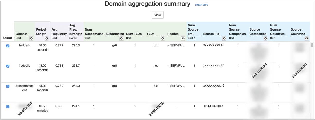
In large logs, such as those spanning several months from a large organization, it’s common to have millions of entities. From these, the algorithm may find that several thousand exhibit periodic activity. Our tool aggregates the entities into several tables. These tables help analysts find suspicious activity (Figure 1 shows an example where entities are aggregated by the query domain). Users can sort and filter these entities to hide periodic activity to common, expected domains, such as windowsupdate.microsoft.com. Users can also use the tables to find strong periodic activity to uncommon, unusual domains—this could be activity that is trying to hide in the noise.
Conventional visualization wisdom says to show this data in some sort of overview visualization. However, we found these tables to be an effective way to group thousands of entities into a few hundred meaningful rows. Users can then easily sort or filter the rows by cyber-relevant features, such as domains or port ranges.
Visualization Design
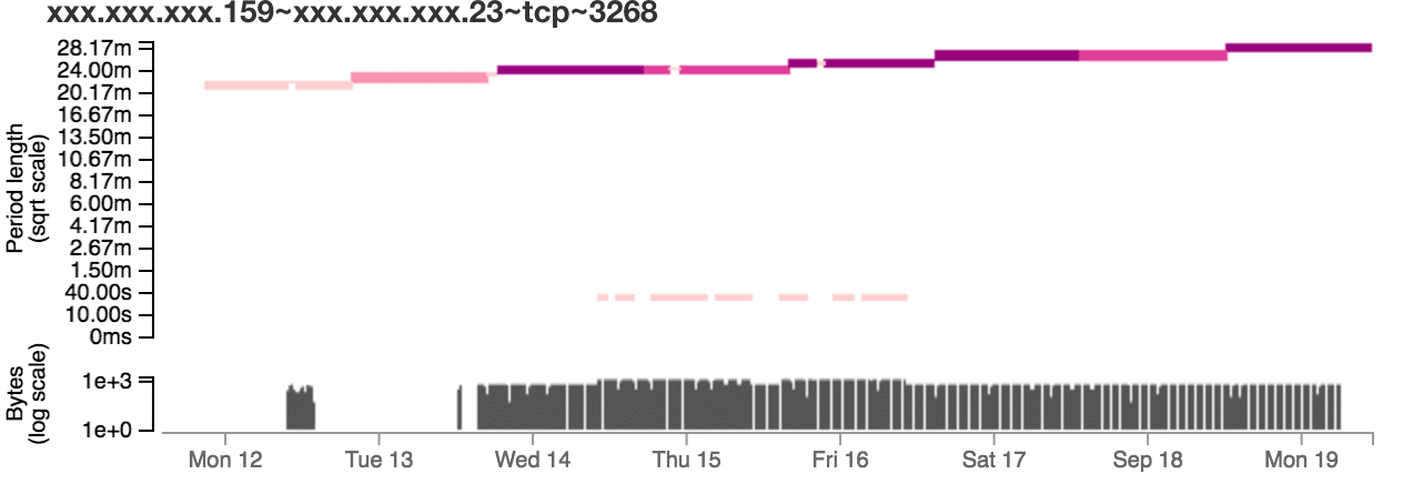
After selecting suspicious rows, users can view a detailed visualization to investigate those entities further. Figure 2 shows an example of the visualization. The colored bars indicate when the algorithm detected periodic activity and the associated period length. Below, the visualization shows the entity’s time series from the network log so users can correlate detected behavior with the log data. In Figure 2, it’s easy to see that the period length is increasing over time. This is an insight that could be difficult to see without the use of a visualization.
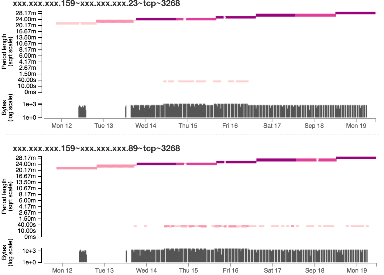
One advantage of this tool design is that if users find suspicious activity from a malicious domain or IP address, users can go back to the aggregation table and filter the tables to show only data for that domain or IP. This enables users to easily find other related activity.
Demo and Further Reading
This demo video shows the tool in action, including the visualization’s interaction capabilities, like filtering and details on demand.
For more details on the algorithm and the visualization design, see our paper published in VizSec 2018.
Gove, Robert and Deason, Lauren. “Visualizing Automatically Detected Periodic Network Activity.” Proceedings of the IEEE Symposium on Visualization for Cyber Security, 2018. Preprint PDF.
This research was developed with funding from the Defense Advanced Research Projects Agency (DARPA). The views, opinions and/or findings expressed are those of the author and should not be interpreted as representing the official views or policies of the Department of Defense or the U.S. Government. Distribution Statement “A” (Approved for Public Release, Distribution Unlimited).