I joined the Advanced Analytics team in January to focus on data visualization for my six-month co-op at Two Six Labs. As the primary front-end developer for the MAGICWAND team, I designed an interface for the visual analysis of network traffic for systems under attack. The MAGICWAND system focuses specifically on low-volume Distributed Denial of Service (DDoS) attacks and aims to detect and mitigate such attacks using system-level sensors and a machine learning classifier. The interface provides users with multiple views into traffic data to better understand system behavior and derive insights from events such as DDoS attacks, client connections, and mitigation attempts. In its current deployment, the visualizations have already proved to be a valuable tool for the development of MAGICWAND.
Overview
The MAGICWAND system allows for the creation of tests where users (e.g. data scientists or SOC analysts) can specify parameters for a DDoS attack in a controlled environment. As a result, we can analyze a system’s behavior with respect to the curated input providing us with detailed, labelled data to reference. This quality is especially useful for analysis. When you use the web, you make requests to a server to load content such as web pages or images. We expect a healthy web server’s requests/connections to progress regularly through the stages of the TCP state machine, therefore, the absence or irregularity of TCP state transitions may indicate that the system is under attack. By looking at state transitions in parallel with DDoS/network events, we are able to monitor the effect of mitigation attempts on system behavior with respect to both benign and malicious client connections.
Interface
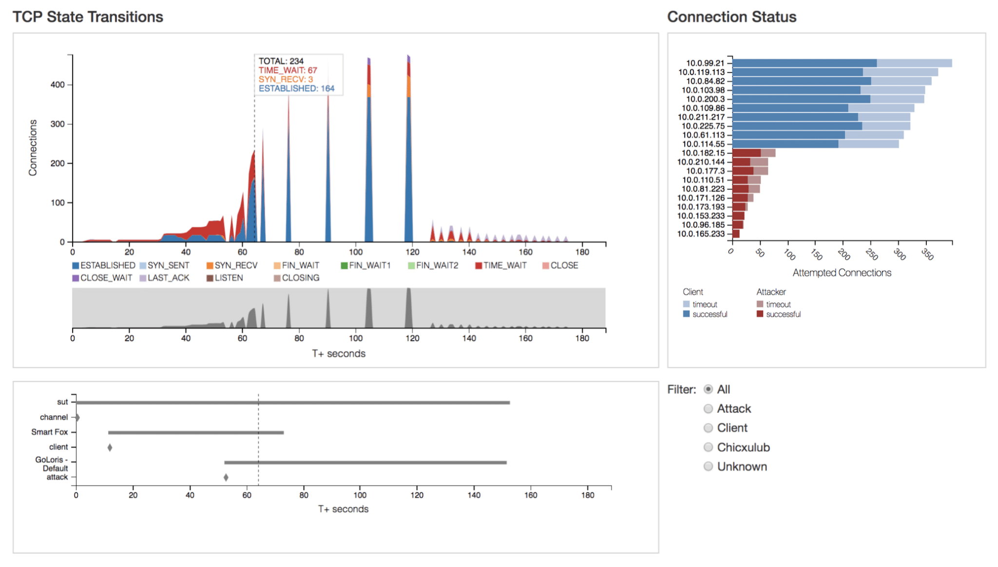
As the main component of the interface, the “TCP State Transitions” graph (Fig. 1 top left) displays network activity broken down by TCP state transitions. It is supported by the events chart (Fig. 1 bottom left) identifying the timeline of network events (e.g. client connection, attack). The “Connection Status” chart (Fig. 1 top right) displays the number of attempted connections by remote host as well as the breakdown of successful vs. timed-out connections.
Connection Status
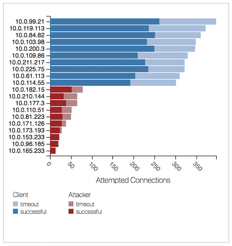
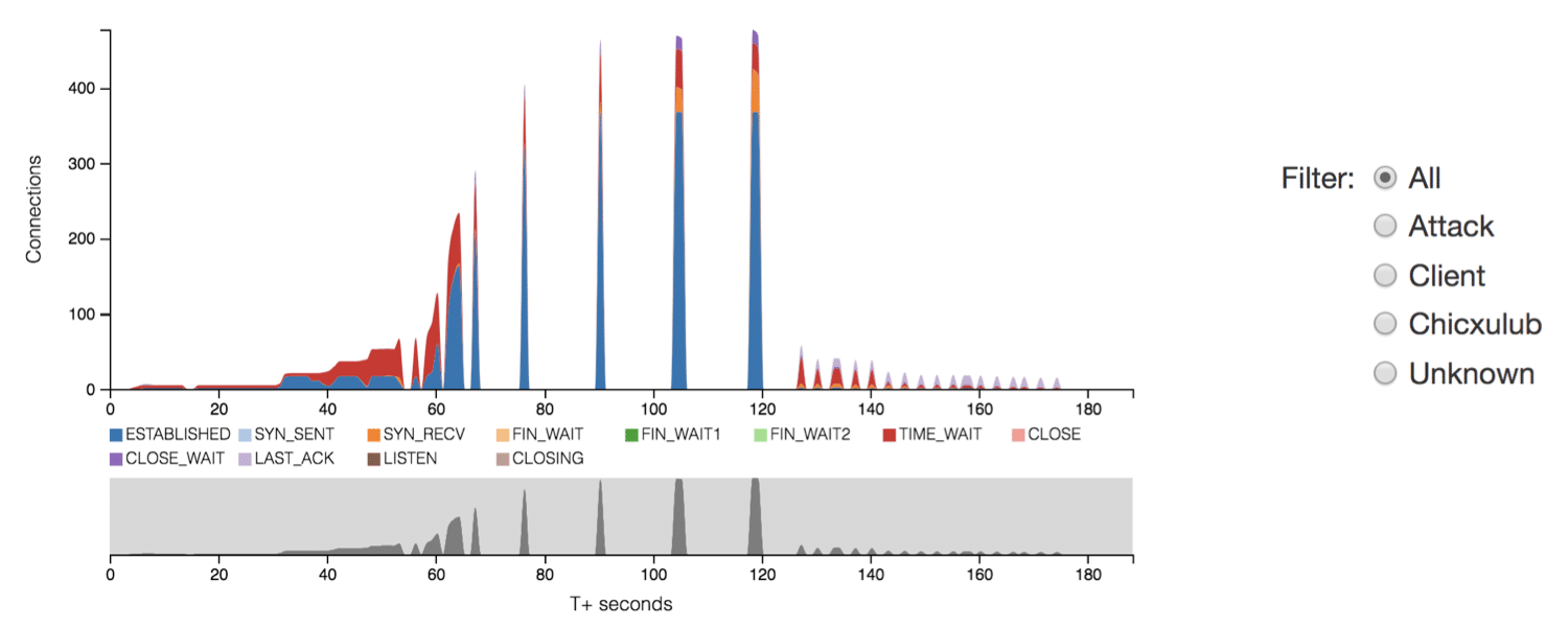
The “Connection Status” chart in Fig. 2.1 above supports the main “TCP State Transitions” graph by displaying the distribution of attempted connections—both successful and unsuccessful or timed-out connections. This visualization effectively illustrates the effect of attacks and the system’s response to network events. The scope of the chart is limited to the selected time range of traffic and updates dynamically as users adjust the selection using the context bar shown below in Fig. 2.2.
Events Data
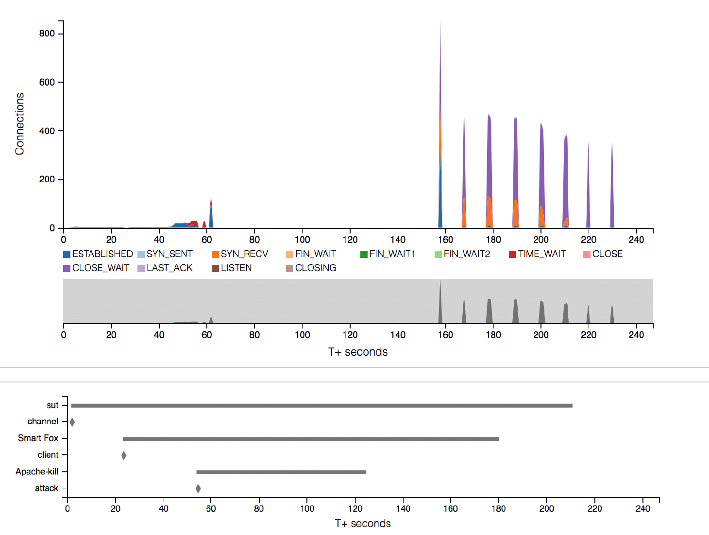
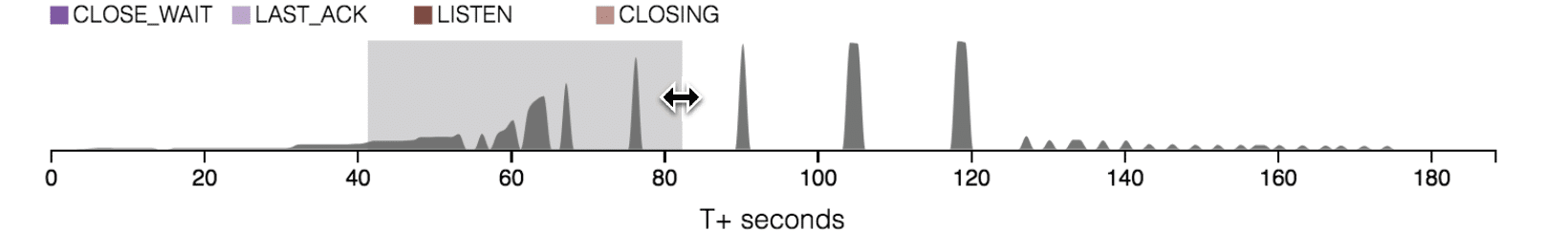
Among the most insightful data available is that which relates to both DDoS/network events and mitigation attempts. When pairing event data with TCP state transitions, it becomes easier to understand a system’s behavior. For instance, the bottom left of Fig. 3.1 above shows the “Apache-kill” attack beginning 55 seconds into the test at which point regular state transition activity halts. The attack ends at approximately 125 seconds and TCP state activity resumes, albeit irregularly, soon after at approximately 155 seconds. In the lower portion of Fig. 3.2 below, the end of the “Sockstress” attack at 101 seconds corresponds to the occurrence of a sudden spike in transitions seen in the upper portion of the figure.

Interactivity
Interactivity is crucial to allow for an in-depth analysis of the data. In the context of MAGICWAND, the structure of the data requires the ability to examine sections of a test run in greater detail. Fig. 3.2 above highlights the tooltip functionality and how it relates to the use of event data for analysis. Hovering over the “TCP State Transitions” graph reveals tooltips that display the total number of connections and TCP state breakdown for the selected time. The tooltip extends to the events graph as well and provides further insight and guidance for reading the data and drawing comparisons.
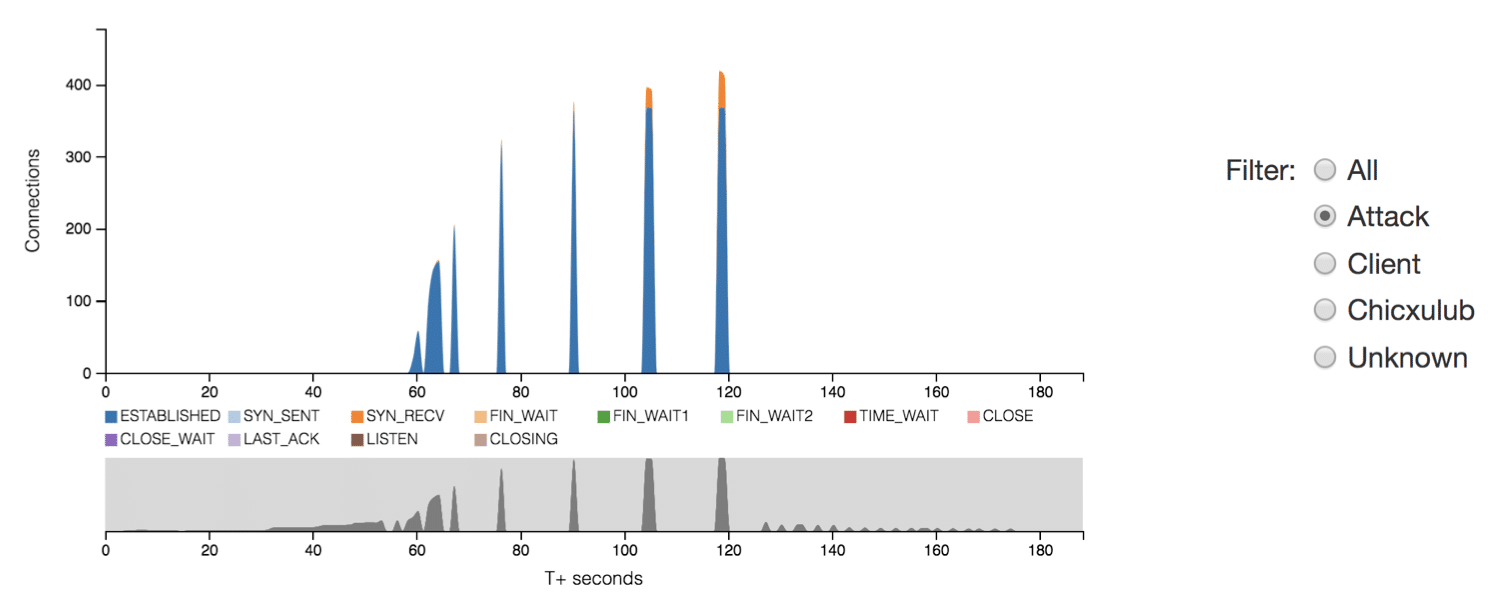
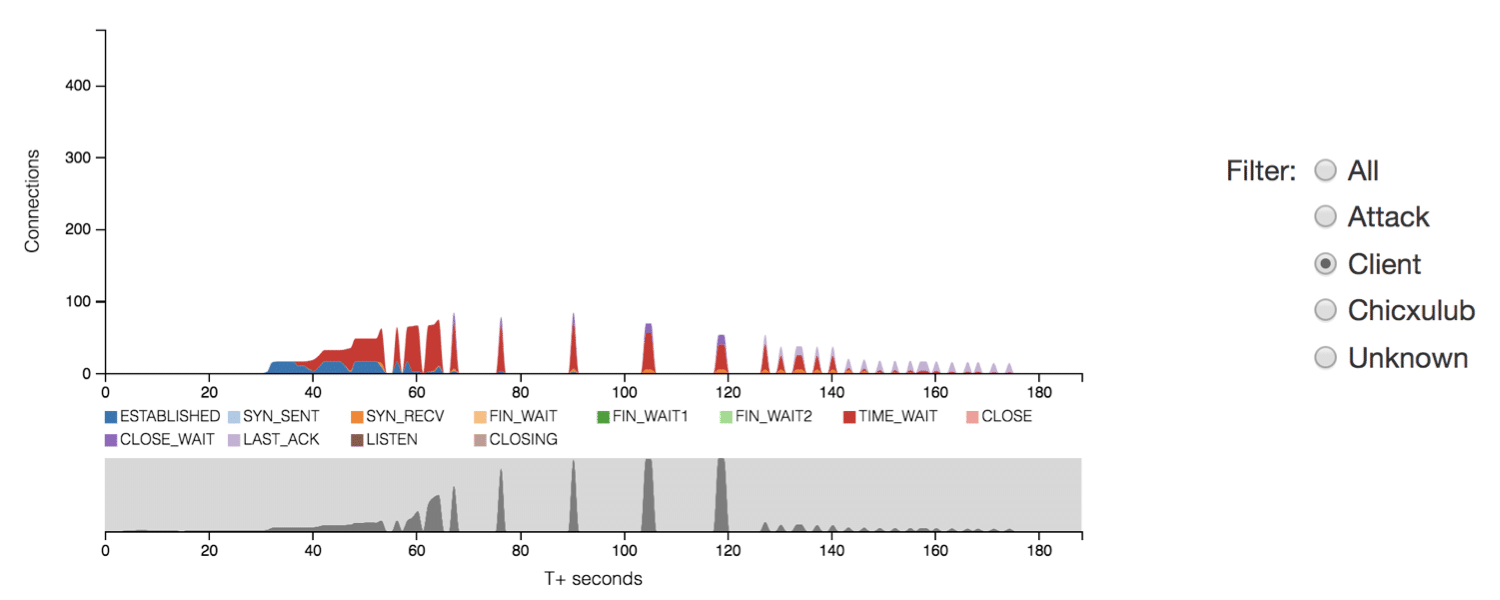
Interaction affords users navigation through layers of hierarchical data and allows users to set parameters for viewing specific subsets of traffic. For instance, as illustrated in Fig. 4, radio buttons allows users to filter traffic by remote host type (e.g. Client, Attacker) or the sensor (e.g. Chicxulub) from which the connection was recorded.
Conclusions
Network traffic data is complex but visualization tools are effective for understanding system behavior. Visualizing TCP state transitions and event data can provide valuable insight into how a system responds to DDoS/network events as well as mitigation attempts. Finally, interactivity affords the ability to examine the hierarchical structure of network traffic and distinguish patterns between benign and malicious clients. The MAGICWAND system visualizations have already proven useful for successfully diagnosing abnormal system behavior. Within the first two weeks of deployment, a team member used the interface to successfully identify and resolve a long-standing bug.
Acknowledgments
I’d like to take an opportunity to thank Tony Wong, Patrick Dwyer, and the rest of the MAGICWAND team for their ongoing support and feedback throughout the duration of my co-op and development of the interface. A special thank you to Robert Gove for his patience and mentorship—teaching me so much over the past six months. Finally, an extended thank you to the entire Data Science and Analytics teams for an amazing time here at Two Six Labs.
This research was developed with funding from the Defense Advanced Research Projects Agency (DARPA).
The views, opinions and/or findings expressed are those of the author and should not be interpreted as representing the official views or policies of the Department of Defense or the U.S. Government.