We discuss our research on a user interface to explain automatically generated severity scores for network intrusion alerts and incident reports. At Two Six we’ve developed several machine learning systems to detect incidents. And recently we developed a model to automatically prioritize and score incident reports for security operations center (SOC) analysts. But we found that analysts need explanations to understand why an alert or incident report is high or low severity.
So we developed a user interface for analysts to see details explaining an alert or incident report’s severity. We supplement the severity explanation with corresponding severity charts, victim and attacker IPs, and a list of similar incident reports.
Interface
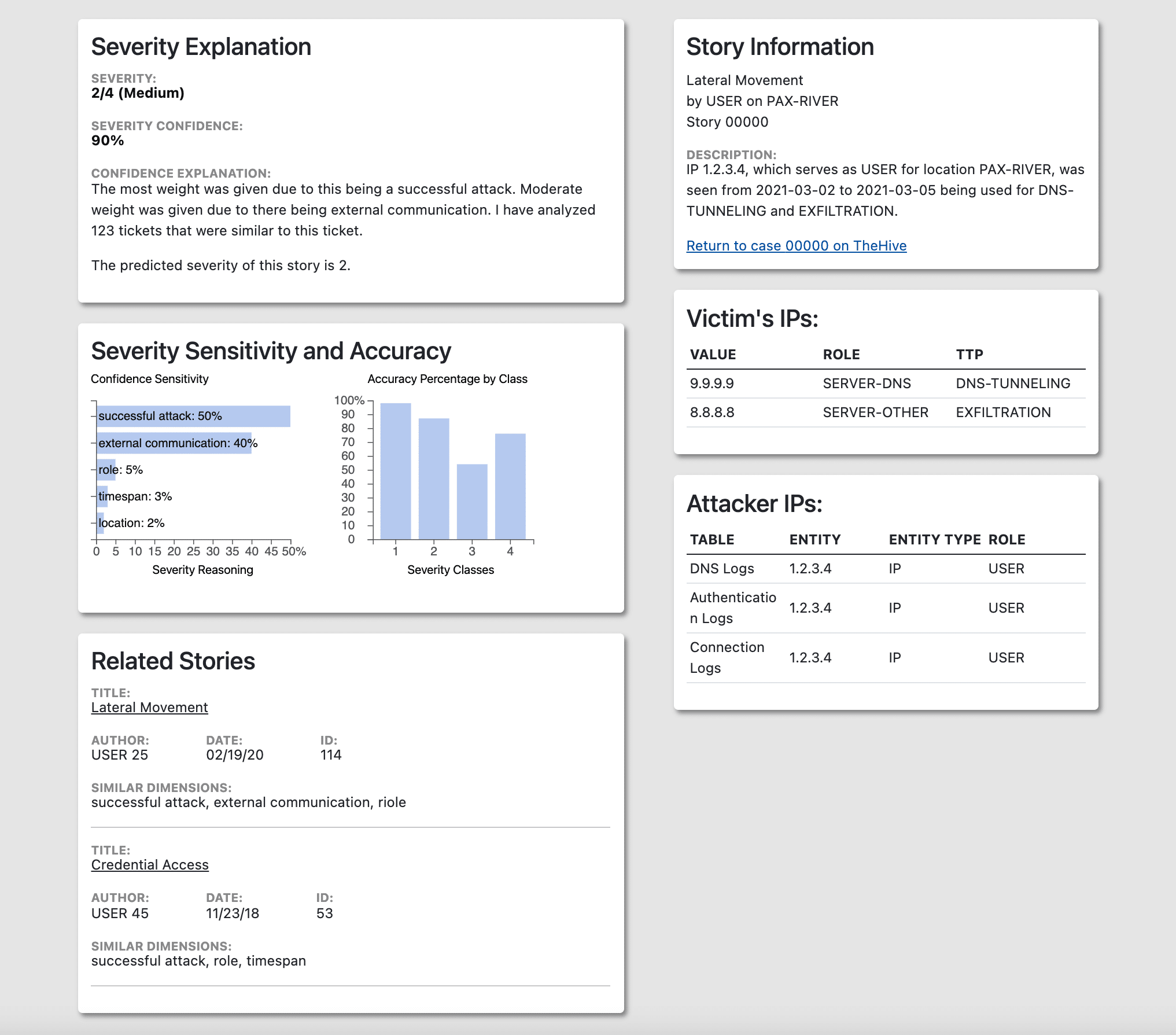
The interface includes five components. Severity Explanation (Fig. 1 top left) gives detail into the severity of the particular alert. Story Information (Fig. 1 top right) describes specifics of the alert. Severity Sensitivity and Accuracy (Fig. 1 middle left) helps visualize the severity explanation. Victim IPs (Fig. 1 middle right) and Attacker IPs (Fig. 1 bottom right) list the specific IPs found in the alert. Related Stories (Fig. 1 bottom left) detail similar stories to the respective alert the user is on.
Severity Explanation
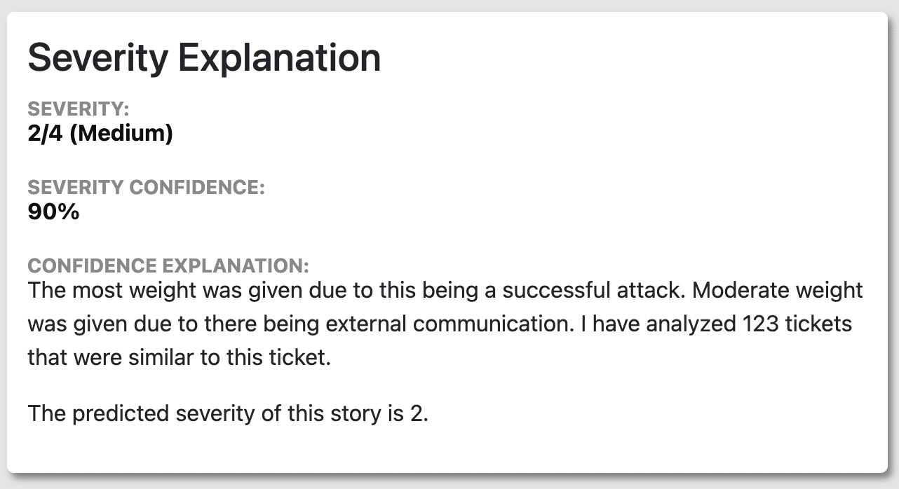
The Severity Explanation component includes 3 sections: Severity Score, Severity Confidence, and Confidence Explanation. This component provides analysts more context about how severe an alert is beyond a number. Essentially, this explains why an alert is bad. This is particularly helpful with “high” or “critical” severity alerts. The Severity Score is determined by the machine learning model’s confidence; it assigns the score with the highest confidence to the alert. In this example, severity score 2 has the highest confidence and therefore will be the severity of the alert. The severity confidence results from the corresponding Confidence Sensitivity chart and its categorization of features.
Story Information
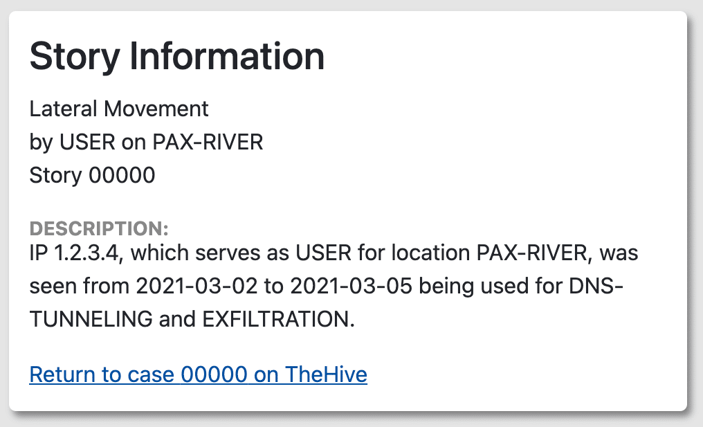
The Story Information component contains alert related information such as alert title, role, location, and description. Having alert-specific information on the same page as the severity explanation provides further context for analysts to see how severe an alert is.
Severity Sensitivity and Accuracy
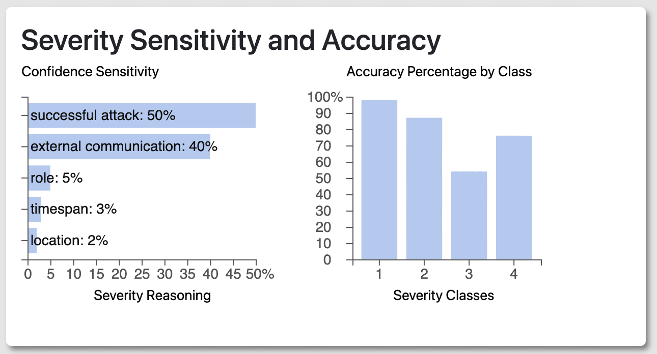
The Confidence Sensitivity chart lists the features that make up the Confidence Explanation in Figure 2.1. Confidence explanation directly correlates with the weights spread between the features (i.e. successful attack, external communication). For example, the more weight given to a successful attack equates to a higher Severity Confidence percentage.
The Accuracy Percentage by Class chart describes the machine learning model’s historical accuracy when predicting each severity score. This gives context to analysts and helps them decide whether to trust the predicted severity, i.e. whether the machine learning model is usually accurate when making the given prediction.
Victim and Attacker IPs
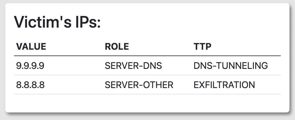
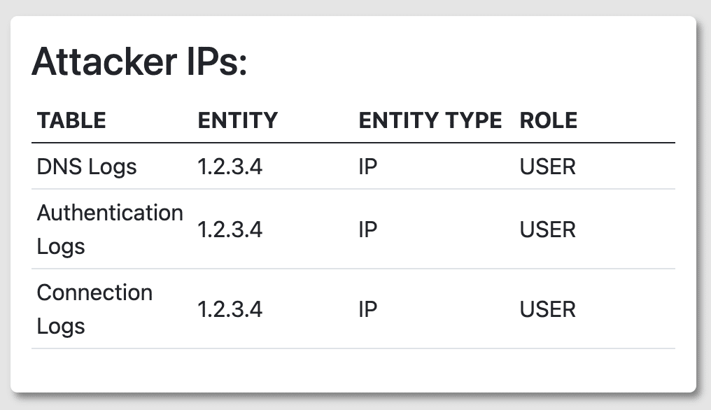
Figures 2.4 and 2.5 list both tables of the IPs from victims and attackers. Having two separate lists of IP addresses provides analysts a clear distinction between who was attacked and who the attackers were. In the Victim IPs table, having specific TTPs listed allows analysts to gauge the severity of an attack and possible remediation. On the flip side, analysts can look at the TTP and determine the lack of severity as well. For the Attacker IPs table, knowing the specific table that logged the attack also provides analysts with how to locate the data.
Related Stories
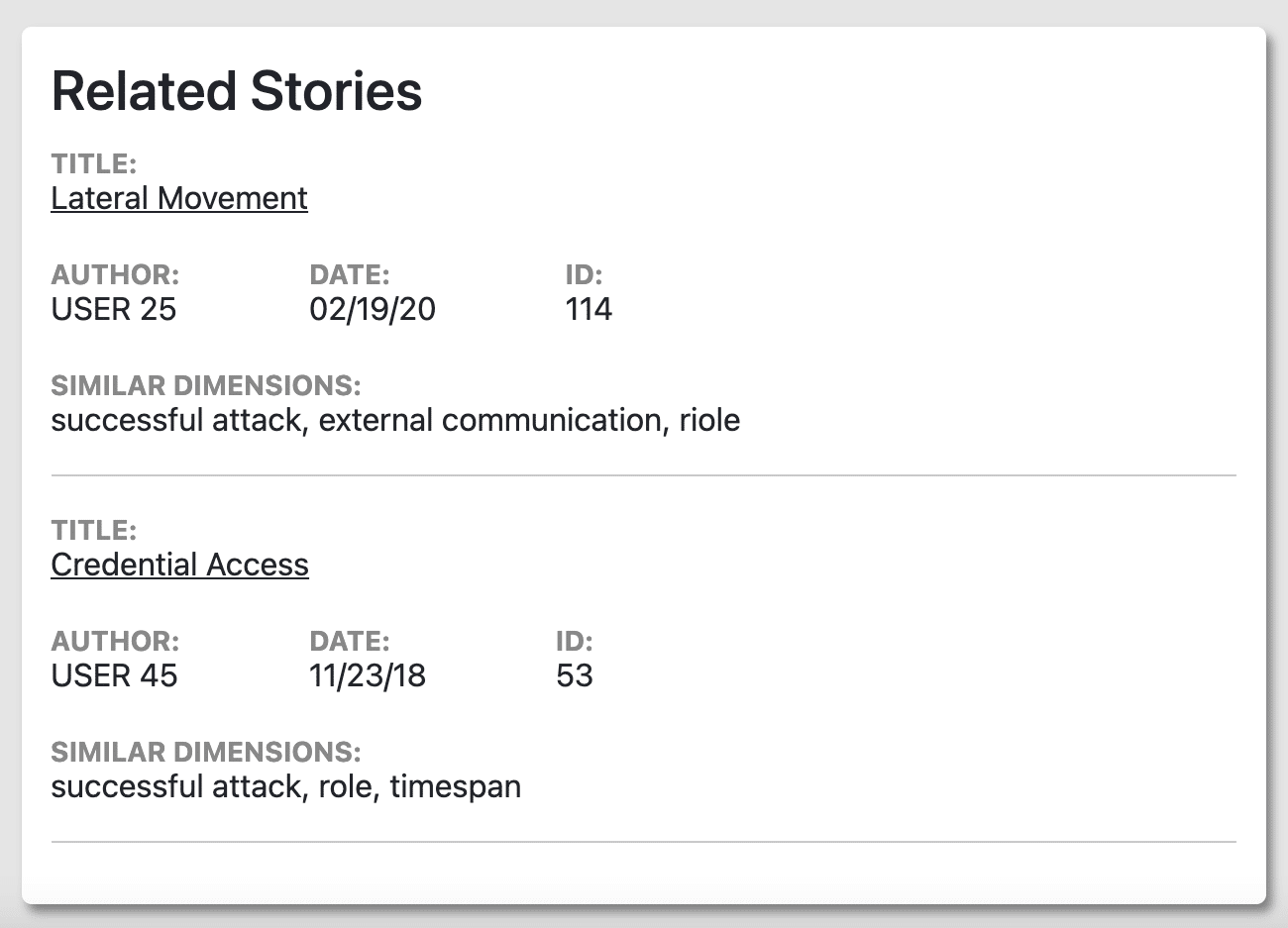
Related Stories shows a list of alerts with similar attributes. These attributes are the features shown in Figure 2.3, and the Similar Dimensions in Figure 2.6 shows which features were similar to other alerts. A top-down combination of most features (not just the top two necessarily) are what deem an incident report to be similar to another incident report.
Lessons Learned
We got some interesting and useful feedback from a SOC analyst. First, he liked the way it looked and he felt that good-looking UIs are important. He also liked the links to related stories; for example, because similarity is determined by higher level features and not infrastructure, it could help identify alerts from the same phishing campaign.
On the other hand, he suggested making the explanation more succinct by using “critical” or “low” instead of numeric severity scores, making the victim and attacker IP tables have the same design, and directly showing which features influenced the severity score instead of the full list of features and their scores. He also suggested modifying the Related Stories card to also include the values for each of the similar dimensions.
Conclusion
Cyber security attacks are considered to be one of the biggest threats to people in the 21st century. Solar winds is an unfortunate but real example of the effects of a cyber security attack and the danger future attacks can present to society. For analysts, having as much information as possible when looking at existing incident reports enables better decision making to address current attacks and mitigate attacks going forward. And these severity explanations help provide the context to do just that.
Distribution Statement “A” (Approved for Public Release, Distribution Unlimited).