Graph datasets are everywhere, and whether you call them graphs or networks, visualizing them is a challenging problem. In some sense, graph visualizations take an n-dimensional dataset and visualize it in two dimensions. (Or three dimensions, but that’s a debate for another day.) It might seem like we are losing a lot of information, but by carefully choosing the visualization we can actually enhance (or hinder!) our ability to find trends, patterns, clusters, or outliers in the data.
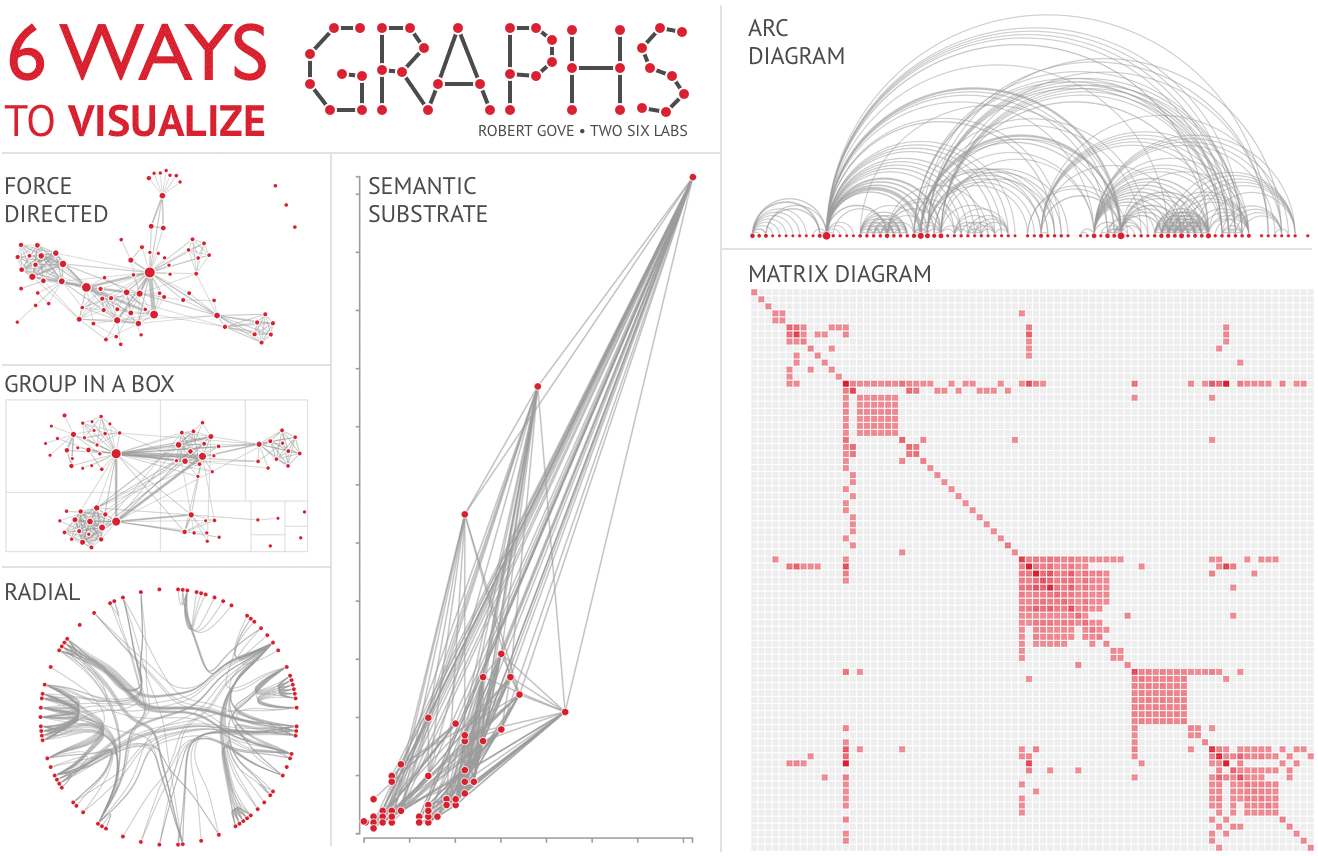
Let’s talk about six ways you might visualize graphs. We will use the Les Miserables dataset for each example so we can see how different visualizations help us answer different questions about the novel.
Force-Directed Layout
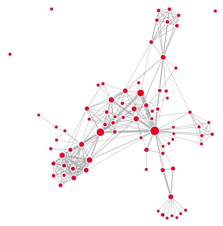
Force-directed layouts are a type of node-link diagram, where the graph is visualized as nodes with links connecting them. The force-directed layout is one of the most common ways to visualize a graph. The basic algorithm works like a physics simulation where nodes push each other away, but links between nodes pull them together.
One advantage of force-directed layouts is that they produce similar layouts as humans1. Studies show that node-link diagrams are better suited for sparse graphs with tens of nodes2,3,4 and for the task of tracing paths between nodes1,2,3. However, large or dense graphs produce “hairball” node-link diagrams that are difficult to understand.
Algorithms for force-directed layouts are actually a family of algorithms, and they have many cousins that produce similar visualizations, such as stress majorization and multilevel algorithms.
Group in a Box
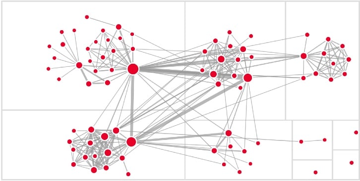
What if you want to see connections within and between groups of nodes? The group-in-a-box layout has your back! This example uses the classic group-in-a-box layout. Each group of nodes is placed in a region of a treemap, and the nodes within a group are laid out using a force-directed layout. This allows us to see intra- and inter-group relationships.
Node grouping can be quite flexible. Groups can be communities or clusters of tightly connected nodes. Groups can also be formed by nodes that share the same attribute, such as country of origin.
Radial
Radial layouts position nodes in a circle, typically grouping nodes so you can see connection patterns within and between groups. In this regard it is similar to group-in-a-box layouts. Nodes can also be laid out using a linear node order, which can be especially useful if there is a cyclic nature to the node order.
A radial layout can work well for smaller graphs, but use caution for large graphs. When there are hundreds or thousands of nodes there can be a lot of wasted space and it can be difficult to fit the entire visualization on the screen.
Tracing links can sometimes be difficult, especially if there are lots of links. This example uses edge bundling, which can reduce clutter and create a pleasing aesthetic. But it can also make it harder to trace individual links from one node to the other.
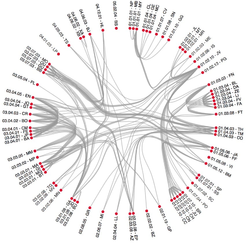
Arc
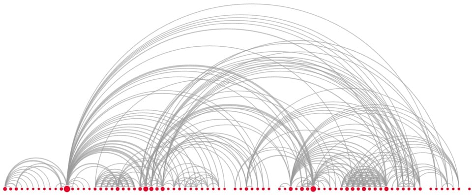
Arc diagrams show the graph’s nodes in a linear order, like the order that characters were first mentioned in a book. This makes them a useful tool for examining sequential patterns in graphs. Arc diagrams have been used to explore references within books and periodic structure in music.
Be mindful of some design considerations. The size of the visualization can quickly become too large if there are more than a few hundred nodes. It can also be difficult to identify clusters of tightly connected nodes because the layout emphasizes order and not clusters.
Semantic Substrate
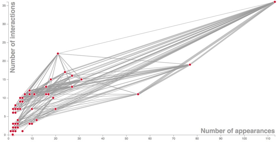
If we take an arc diagram and add a second axis, we get a semantic substrate. It’s like a scatterplot, but with links connecting nodes.
Semantic substrates can simultaneously show node connections as well as trends, patterns, clusters, or outliers in the nodes’ attributes. As with arc diagrams, this comes at the expense of being able to easily see some types of node connection patterns like motifs or clusters of connected nodes.
Matrix Diagram
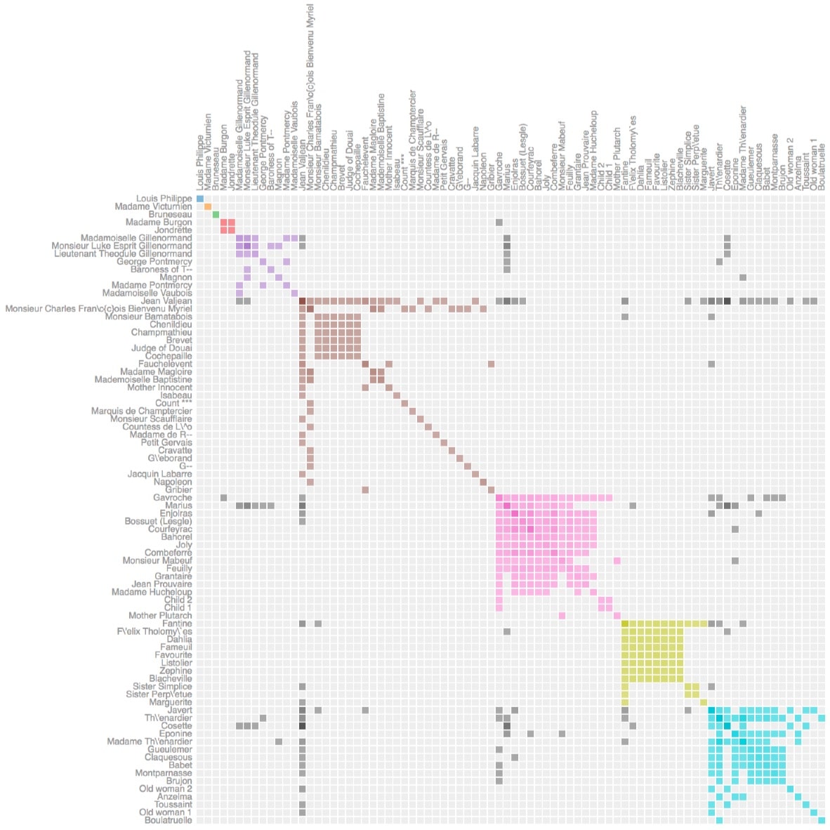
Matrix diagrams show the graph as a grid. Each node has a row and a column, and cells are filled in if there is a link connecting two nodes. It’s a good visualization choice for many analysis tasks, such as counting the number of nodes and finding common neighbors between nodes, especially for dense graphs with lots of links2,3,4.
One benefit of matrix diagrams is that there is never any occlusion, whereas node-link diagrams can have nodes and links drawn on top of each other, making the visualization harder to understand. Matrix diagrams can work especially well if the rows and columns are ordered to reveal the structure of the graph. In this example, the visualization shows clusters of connected nodes grouped together in squares. But if there are many nodes, it can be hard to make the labels legible and still fit the entire matrix on the screen.
Caveats
These six visualizations are common, powerful ways to visualize graphs, but there are lots of other techniques designed to answer other types of questions. For example, other visualizations show changes in a graph over time, and some visualizations work better with large graphs.
Some of these visualization recommendations are based on perceptual research from the scientific community. One thing to keep in mind is that a lot of existing research focuses on visualizing small graphs (i.e. graphs with 100 nodes or fewer). There are a lot of open questions for large graphs, for example we do not have empirical evidence about what kinds of tasks are easier to perform on node-link diagrams versus matrix diagrams of large graphs. We need more research in this area to provide guidance to visualization practitioners as well as to illuminate the shortcomings of visualizations and guide future graph visualization research.
Further reading
- Frank van Ham and Bernice Rogowitz. Perceptual Organization in User-Generated Graph Layouts. IEEE Transactions on Visualization and Computer Graphics, 14(6):1333–1339, 2008.
- Rene Keller, Claudia M. Eckert, and P. John Clarkson. Matrices or node-link diagrams: which visual representation is better for visualising connectivity models? Information Visualization, 5(1):62-76, 2006.
- Mohammad Ghoniem, Jean-Daniel Fekete, and Philippe Castagliola. A Comparison of the Readability of Graphs Using Node-Link and Matrix-Based Representations. IEEE Symposium on Information Visualization, pages 17-24, 2004.
- Mohammad Ghoniem, Jean-Daniel Fekete, and Philippe Castagliola. On the readability of graphs using node-link and matrix-based representations: a controlled experiment and statistical analysis. Information Visualization, 4(2):114–135, 2005.