
Mission Focused. Impact Driven.
This is
Two Six Technologies
Logo, color, typography, voice, graphics, components, motion, and tokens — the canonical source for every Two Six touchpoint.
00 — Who Are We
Innovation at speed
to solve global challenges.
At Two Six Technologies, we provide innovative products and expertise that solve today's most complex real-world challenges.
Through unrivaled collaboration and unwavering trust, we push the boundaries of what's possible to support our customers and empower our team. We develop, deploy, and implement novel products and deliver advanced, cutting-edge solutions and expertise to support national security customers and solve real-world challenges. We bring innovation to the mission.
How to use this guide
One brand. One voice.
This kit sets the standard of quality, tone, and identity for the Two Six Technologies brand. It is for every team member to read, internalize, and reference when creating internal or external collateral, or presenting our capabilities to customers.
Who it's for
Every department.
All team members in all departments must adhere to these guidelines so the brand stays powerful, consistent, and distinct across every channel — now and as the company grows.
Exceptions
Ask before you improvise.
Questions on the guidelines, new collateral, and any exception go to the marketing team at [email protected].
01 — Foundation
The value we provide
Products with purpose. Missions with impact. Mission, vision, and the six values that decide how we work.
Mission
Delivering technological superiority for our nation, allies, and partners through rapid, impact-focused innovation.
Leads every capabilities deck, every proposal, every about page.
Vision
To be a trusted partner who delivers technological products and expertise that elevate US national security.
The aspirational frame — where the mission is pointed.
Why we're here
Delivering technological superiority for our nation, allies, and partners through rapid, impact-focused innovation.
Why we do it
Making a positive impact across the globe by solving urgent national security issues and the most serious humanitarian challenges facing vulnerable populations. We put the community first — from regular team-building experiences to the annual Two Six Day of Service.
Our Company Values
Candid communication and open access across the company are at the core of who we are and how we operate.
Passion
Shine brighter together
Passion is not a term we use lightly. Our team of unique professionals tackles challenging yet critical problems, and we require persistence and grit to solve the thornier issues before us.
Opportunity
Value in every voice
We strive to build a safe, honest, and empathetic community. Our organization comprises people with eclectic backgrounds, experiences, perspectives, and beliefs — and we encourage our team to share differences and grant others space to express theirs.
Flexibility
Empower the whole person
TST functions at the intersection of impact and innovation, which requires flexibility at speed. We value elastic thought and adaptive methods — and above all the essential asset fueling our success: our people.
Grace
We are human
People are human, so we treat them like humans — prone to err but worthy of compassion. Grace lets us be vulnerable, humble, and honest with each other and with our clients.
Purpose
Mission focus, team always
While mission and passion drive our ethics, our purpose unites us. Our multidisciplinary team brings together disparate perspectives — essential to solving the most challenging problems and building the best teams.
Innovation
Brave enough to fail, confident enough to deliver
Innovation at Two Six Technologies invites us to be brave. We operate in challenging, rapidly evolving environments. These problems are complex because the solutions are hazy — but iteration leads to progress.

Science. Impact. Innovation.
The Two Six Technologies story
We founded Two Six Technologies to make a positive impact on the information environment across the globe. Our work addresses urgent human security challenges faced by the world's vulnerable populations. What's more, we take pride in putting community first.
02 — Logo
Our logo
The logo is the center of our visual identity. The DNA strand represents the tension between operations and technology; locked up with the name, it states our capabilities, approach, and mission in one simple mark.
Logo Lockups
Full lockup where space allows, mark where it doesn't. The mark can stand alone once the full name has been established in the layout.
Primary Lockup
Mark

Favicon

Wordmark — name only, for tight horizontal bands

Logo Colors
Two-color is the standard lockup — Navy + Grey on light and white surfaces, White + Grey on navy and dark. The two-color treatment is original to the mark and is what appears on Two Six office signage. One-color only when two-color cannot reproduce.
Primary
Standard use across all brand touchpoints
Navy + Grey
on #FFFFFF
Navy + Grey on Paper
on #F1F4F6
White + Grey
on #002643
Conditional
Only when full color is unavailable
One-color Black
on #889EA9

One-color White
on #01121E
White on Royal Blue
on #1E41DD
Clear Space
Clear space around the logo must equal or exceed the height of the stacked "Two Six Technologies" wordmark. Nothing — type, image, or edge of page — enters that field.
Logo Misuse
Do not apply effects, outline it, rescale the mark independently, stretch, substitute the logo colors, or change the alignment. The two approved colorways are Navy + Grey and White + Grey — no other palette color is a logo ink. Always start from the source files in the kit.
Don't apply effects
Don't use outlines
Don't alter the scale of the mark
Don't stretch or compress
Don't substitute logo colors
Don't alter alignment
03 — Color
Brand color palette
Three core tones and five supporting colors, representing inspiration, balance, and simplicity. Click any value to copy it.
Primary
Two Six Royal Blue
Two Six Bright Green
Two Six Black
Secondary
Two Six Bright Blue
Two Six Navy
Two Six Grey
Two Six Teal
Two Six White
Gradients
Built only from Primary and Secondary values. Use sparingly and subtly — never behind the logo, never behind long-form reading.
P1 Royal Blue → S4 White
P3 Black → S2 Navy
Aurora — animated brand texture
Body text on black
#F1F4F6 on #01121E — 16.4:1
Muted text on paper
#5D6B78 on #F1F4F6 — 4.9:1
Royal Blue as text
Use on white or paper only — 8.1:1. Never on navy.
Bright Green as text
Dark surfaces only — 9.2:1 on black. Never on white.
04 — Typography
Typography
Designed for clarity and modern lines. Instrument Sans is the whole type system — display, headings, UI, and body copy alike, across digital, print, and online collateral. One family, four weights.
01 — Brand Typeface
Instrument Sans
The entire system runs on one family. Medium (500) at display sizes with tight tracking; SemiBold (600) for titles; Regular (400) for body copy; Bold (700) for uppercase eyebrows and buttons. Available free from Google Fonts, so it ships everywhere without a licence.
02 — Office / System Substitute
Arial
Two Six Technologies uses system fonts for all Microsoft Office assets. System fonts are already installed on most computers, which keeps every department on brand while maximizing efficiency when creating new materials. Use Arial only where Instrument Sans cannot be embedded.
Type Scale
Display / H1
H2 / Section Heading
H3 / Title
Leading-edge products for defense, security, and safety
Body
Two Six Technologies provides innovative products and expertise that solve today's most complex real-world challenges. Through unrivaled collaboration and unwavering trust, we push the boundaries of what's possible to support our customers and empower our team.
Eyebrow / Label
Visual Design · Cyber Missions · CJADC2 · Mission Speed
05 — Voice & Messaging
How we communicate
Simple, innovative, credible. Our tone conveys the expertise and confidence we have in our solutions, in a straightforward and professional manner.
Mission Focused. Impact Driven.
The positioning line. Who we are, in four words.
Innovation at speed to solve global challenges
What we do and how fast we do it — leads capabilities material.
Products with purpose. Missions with impact.
The value we provide, closed with a period.
Science. Impact. Innovation.
The founding story line — used to open the company narrative.
All communications use active voice. "Two Six Technologies uses active voice," never "passive voice is used by Two Six Technologies."
Whenever possible, write in the present tense. "Two Six Technologies provides innovative solutions with real-world results."
Never use a complex sentence when a simple one works. When we can split a sentence, we do. No semicolon where a period will do.
Speak to the reader on a personal level. A reader should feel a team member is speaking to them, not about "customers" and "users."
Messaging Rules & Standards
The rules that make copy checkable. Apply them everywhere — web, proposals, decks, social, and email.
Person
We write in the first-person plural, unless introducing the company for the first time in an article or section — then third-person singular.
Singular then plural
When communicating with our target personas, always lead with the singular and then the plural.
Oxford comma
Two Six Technologies uses the Oxford comma.
Who we serve
Always refer to those we serve as "end users" or "organizations."
Correct Reference of Our Name
Our official name is Two Six Technologies. The only correct alternates are "Two Six" and "TST." No other reference is accurate and none may be used in any messaging.
06 — Graphics
Graphics style
Illustrating illumination visually. Sometimes clarity is easier to see than read — but graphics are never a substitute for well-written, explanatory copy.
Signature Compositions
Two built figures carried over from twosixtech.com, where both are rendered live in the browser. Use them whole, at size, with room around them — don't crop either into a background.
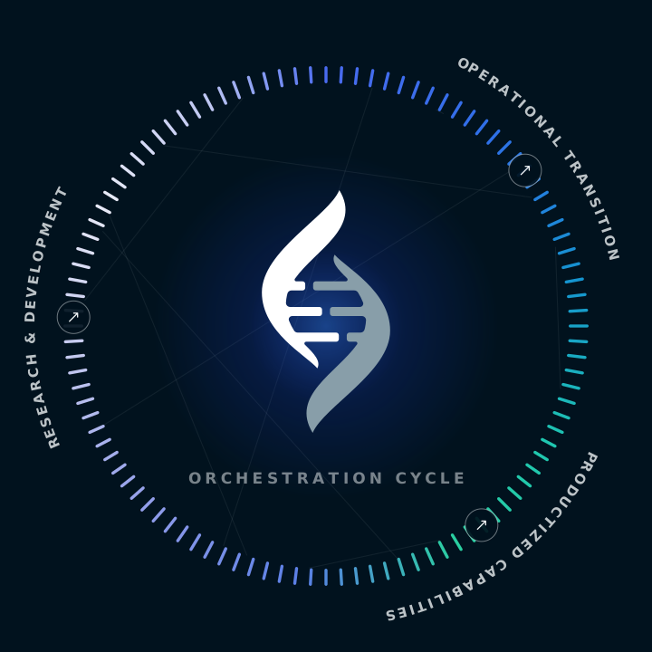
Orchestration Cycle
The integrated cycle of innovation, as one figure. Three stations on the ring — R&D, Operational Transition, Productized Capabilities — around the mark. The hero motif for approach and capability storytelling. Dark surfaces.
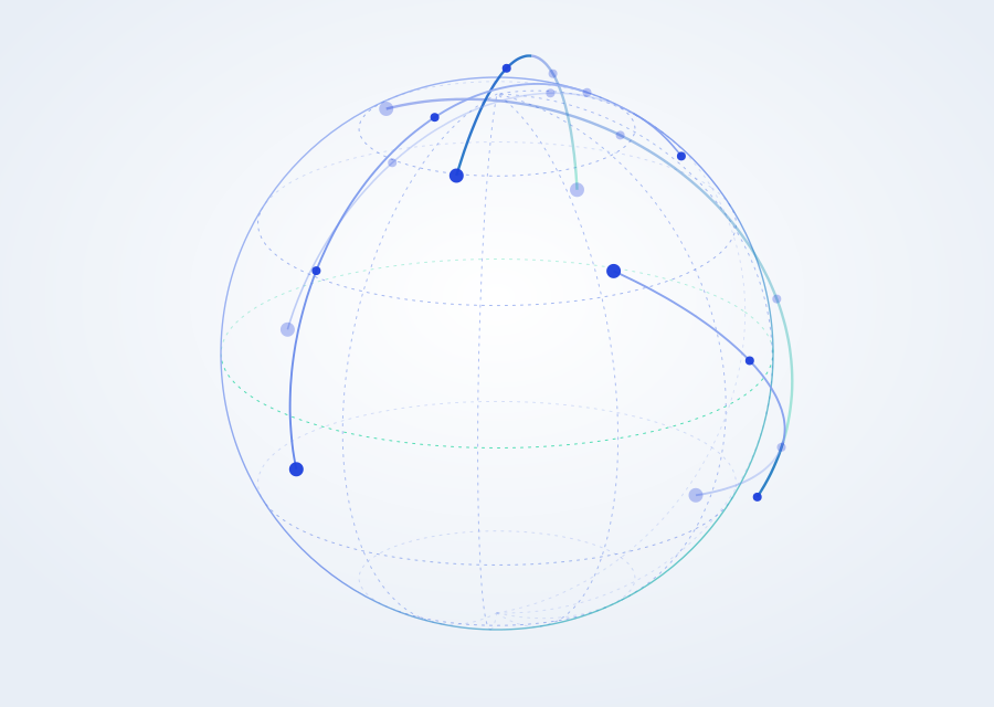
Network Globe
Global scale and allied reach — great-circle routes between partner nodes. Light surfaces only.
Brand Imagery — Capability Renders
Five 3D glass renders, one per capability area. These are the finished production assets pulled from twosixtech.com — use these files, don't redraw them. Each sits on its own pale-blue ground, so place them on white or paper, never on a dark surface or over a gradient.
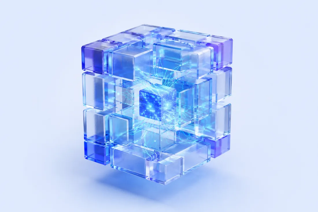
Secure Solutions
Zero trust, encryption, data protection
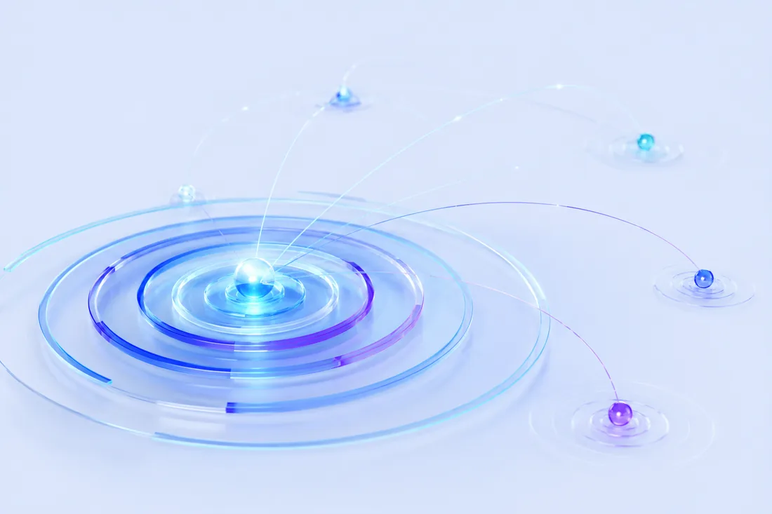
Information Advantage
Sensing, planning, coordinated effects

Data Analytics
Contextualized data and curated insight
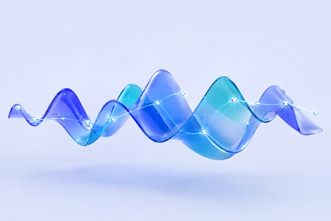
Electronic Systems
Signals, spectrum, electronic warfare
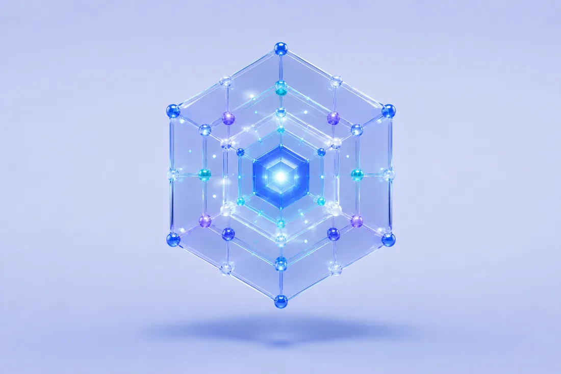
Cyber
Cyber missions and connected architecture
Design Elements — Textures & Patterns
Gradients and aurora fields tell the brand story and signal the innovative thinking behind it. Use them sparingly and subtly so they never overcomplicate a visual. All ship in the kit under graphics/.

Aurora Blue
Hero + campaign surfaces

Aurora Green
Impact + values surfaces

Aurora Light
Light-mode headers

Starfield
Deep-space chrome · site backgrounds

Signal Field
Data + scale motif
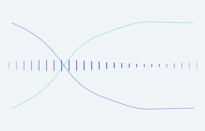
Helix Rule
Section divider · light surfaces

Gradient P1 → S4
Royal Blue to White

Gradient P3 → S2
Black to Navy
Application Icon Suite
Fourteen icons representing our brand, our customers, and the benefits of our solutions. Simple, clean lines; a single concept per icon; no typeface inside the icon; vector format. New icons follow the same rules and must translate to grayscale or white.

Seamless Integration

Mission Speed

Cyber Missions

Contextualized Data

Global Scale

Smart CONOPs

Collaborative Data Control

Curated Insight

Passion

Purpose

Diversity

Flexibility

Grace

Innovation
Photography
A supporting element that conveys the human element of effective security — headers, graphical elements inside text-driven design, backgrounds, and infographics.
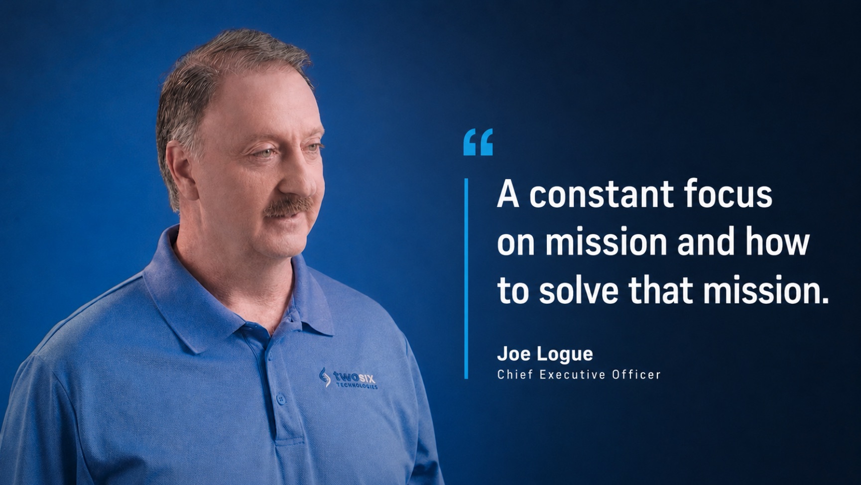
Use real people
When possible, leverage photographs of actual Two Six employees. Subjects should look authentic and relatable — someone who would actually use our products.
Match the personas
Subjects should represent the industries and sectors we target: SOC teams, DevOps, and cyber analysts.
Represent everyone
Photographs should include people of all ages and abilities, playing into the accessibility of the platform.
Show real work
Represent relevant work-life and the product in a way that feels genuine. Avoid meaningless conceptual styling.
07 — Components
User interface
Buttons
Cards
Products
Cyber missions
Capability card — eyebrow, title, one-sentence summary. Graphic fills the header band edge to edge.
Expertise
Contextualized data
Cards sit on the paper surface with a 1px hairline. No shadow — depth comes from the graphic, not the container.
Impact
Global scale
Bright Green marks impact and mission-outcome content. Royal Blue marks product and capability content.
Capability Stack
Secure Solutions
Information Advantage
Data Analytics
Electronic Systems
Cyber
The five capability areas as one object. Cards lie on a shared isometric plane, numbered along the near edge and named along the leading edge, so the whole portfolio reads in a single glance.
Marquee Band
Status
status-success · #24D4A0
status-info · #1667FF
status-warning · #E8A93C
status-error · #E2504A
08 — Motion
Motion system
Aurora on hero and campaign surfaces only. Everything else uses one of three durations and a single easing curve.
Aurora
Hero and campaign surfaces only. Brand blobs drift over the Two Six Black base while a parallax starfield tracks the cursor. Respects prefers-reduced-motion. Never behind long-form reading, never behind the logo.
Headline wipe
Every section headline arrives the same way: each line clips open left-to-right behind a Royal Blue swipe that exits right. 600ms, 150ms stagger per line. White swipe on dark surfaces. Headlines only — never on body copy.
An integrated cycleof innovation.
Durations
Fast for hovers and toggles, base for most transitions, slow for entrances and large surfaces. Easing is always cubic-bezier(0.2, 0.7, 0.2, 1). Hover a card to see it run.
--motion-duration-fast
150ms
--motion-duration-base
250ms
--motion-duration-slow
400ms
09 — Tokens
Quick reference
CSS custom properties for implementation. tokens.css in the kit is canonical — import it rather than copying values into a component.